
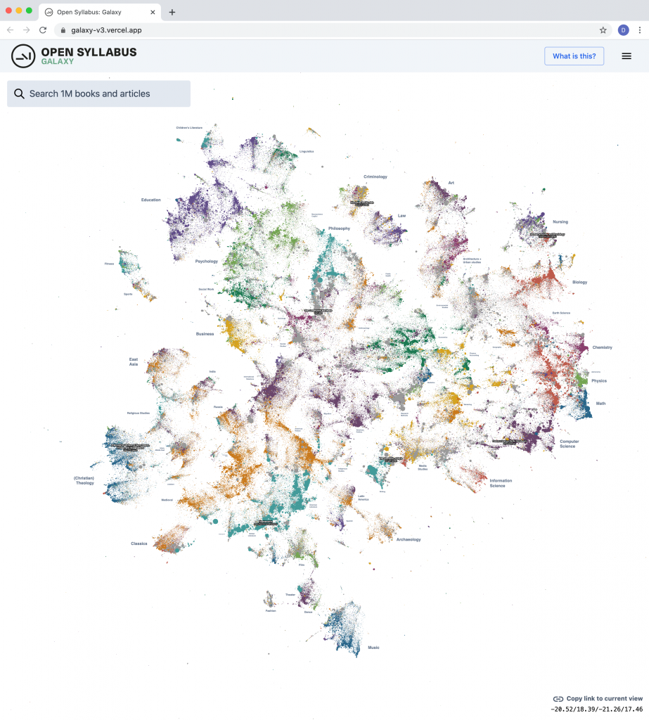
Today we’re excited to release a big update to the Galaxy visualization, an interactive UMAP plot of graph embeddings of books and articles assigned in the Open Syllabus corpus! (This is using the new v2.5 release of the underlying dataset, which also comes out today.) The Galaxy is an attempt to give a 10,000-meter view of the “co-assignment” patterns in the OS data – basically, which books and articles are assigned together in the same courses. By training node embeddings on the citation graph formed from (syllabus, book/article) edges, we can get really high-quality representations of books and articles that capture the ways in which professional instructors use them in the classroom – the types of courses they’re assigned in, the other books they’re paired with, etc.
The new version is a pretty big upgrade from before, both in terms of the size of the slice of the underlying citation graph that we’re operating on, and the capabilities of the front-end plot viewer. The plot now contains the 1,138,841 most frequently-assigned books and articles in the dataset (up from 160k before) and shows 500,000 points on the screen at once (up from 30k before).
http://galaxy.opensyllabus.org/
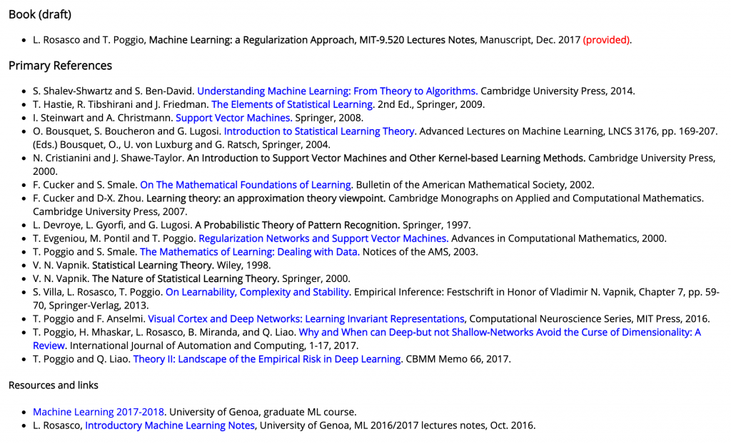
Under the hood, this is a pretty straightforward transformation of the raw citation graph that comes out of the OS data pipeline. The citation extractor identifies references to books and articles in the syllabus, which can take a few different forms – lists of required books, week-by-week reading assignments, bibliographies, etc. Eg, from “Statistical Learning Theory and Applications” at MIT:
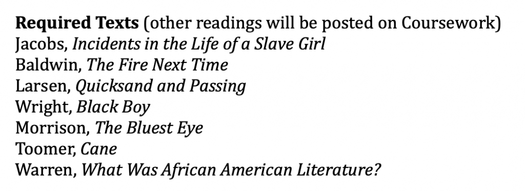
Or, “Introduction to African American Literature” at Stanford:
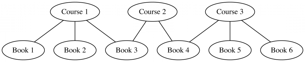
Once we extract these citations and link them to canonical bibliographic records, we get a bipartite graph over syllabi and books/articles (we call them “works”). Eg, say we have:
- Course 1, which assigns works 1, 2, 3
- Course 2, which assigns works 3, 4
- Course 3, which assigns works 4, 5, 6
The edges contributed by each syllabus look like:
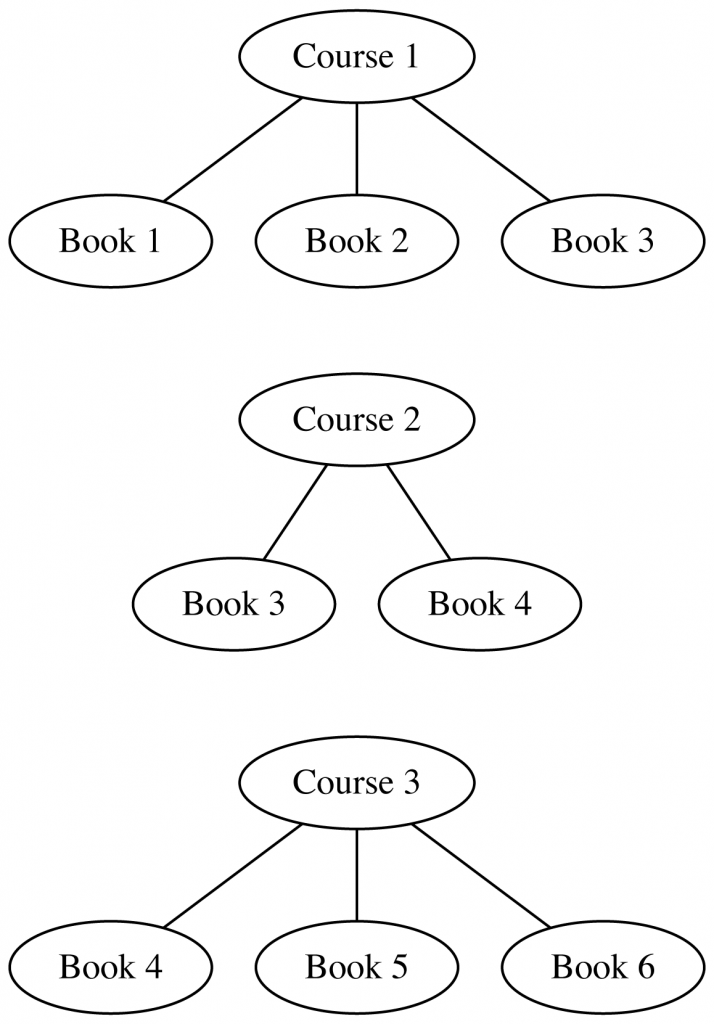
And then, wiring everything up into a single graph:
node2vec → UMAP
The full version of this graph in the v2.5 data quite big – 4,330,717 syllabus nodes, 4,819,773 book/article nodes, and 39,532,201 edges, where each edge represents a single instance of a work getting assigned in a course. For the Galaxy, though, we crop this down quite a bit, in an effort to get a really clean set of inputs – we remove syllabi have a very large (> 50) or very small (< 4) number of assignments. (Both of which, in different ways, seem to muddy up the structure of the final UMAP layouts – this is heuristic, though.) After this filtering, we end up with an undirected graph with 3,423,693 nodes (1,142,666 syllabi, 2,281,027 works) and 13,982,096 edges. Then, we fit a node2vec model on this to get node embeddings for the syllabi and works. After trying a couple different options, we ended up using the C++ implementation in the original SNAP project. On a pretty big EC2 instance (r5a.16xlarge, 64 cores), this takes about 3 hours to fit:
node2vec -i:graph.edgelist -o:graph.emb -d:64 -l:40 -q:0.5
This gives us a 64d embedding for each syllabus and work, a distributed representation of the “position” of each inside the citation graph. From this full 3,423,693 x 64d embedding matrix, we slice out the embeddings for just the work nodes, and, to clean things up a bit more, also drop out works that appear fewer than 3 times in the overall dataset. (So – we treat the syllabi as a sort of glue that binds together the books and articles for the purpose of the graph embedding; but then pull out just the representations for the books and articles.) This leaves 1,138,841 x 64d embeddings, where each represents one work assigned 3+ times in the filtered set of syllabi.
Finally – we project this down to 2d with UMAP, using the GPU-accelerated implementation in RAPIDS, which is really fantastic for this kind of dataset – on a T4 (g4dn.8xlarge EC2 node), the UMAP models fit in the range of ~4-5 minutes on the ~1Mx64 input embedding. This is awesome, and made it possible to experiment with UMAP parameters in a much more wide and systematic way than would have been possible otherwise. (I wish the same were true for the initial node2vec fit…) After running a bunch of parameter sweeps, we settled on:
reducer = UMAP( n_neighbors=100, n_epochs=1000, negative_sample_rate=20, )
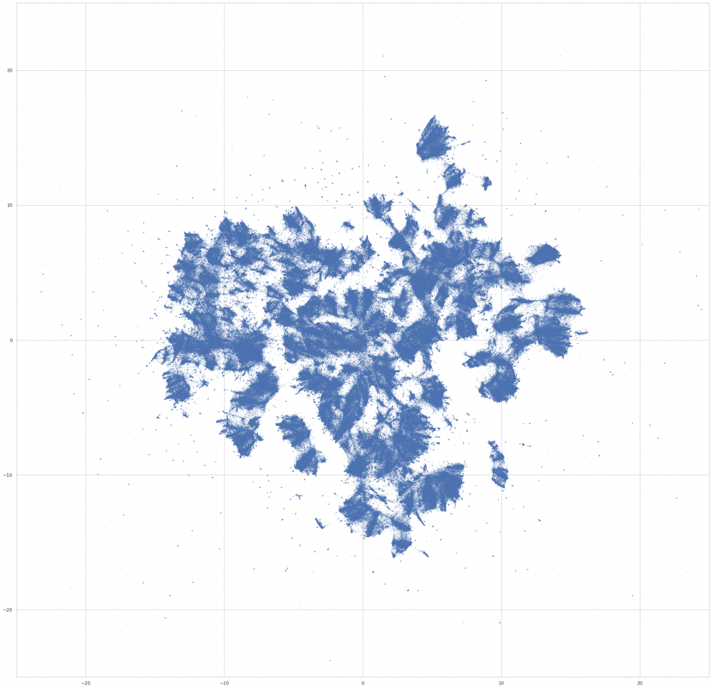
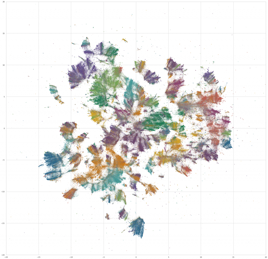
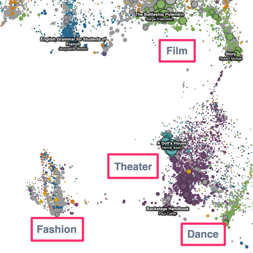
We then do a bit of final preprocessing – we rotate the layout to an orientation that’s visually pleasing (not ahem, the most scientific step), and assign colors to the points based on the fields that the work is assigned in. For the purpose of the visualization, a work is assigned to a field if >50% of its assignments are in courses from a single field. Otherwise, we color it gray, and label it as “Multiple Fields.” (Which, it turns out, makes it possible to find some really interesting interdisciplinary clusters in the embedding space – eg, environmental studies, media studies, and a nexus of sociology / philosophy / critical theory.)
WebGL scatterplots
Once the layout is in place – the process of rendering it interatively in the browser becomes, in effect, a web mapping project, similar in many ways to how you might show literal (geo)spatial data with Leaflet / Mapbox / OpenLayers. We’ve got dataset laid out on a 2d grid, and want to make it possible to navigate the space – figure out what’s where, zoom in and out, inspect individual “locations,” grok the overall structure of the space. Except, geographic space is swapped out for the abstract space of the UMAP embedding.
The first step – like with (literal) map data, the plot is too big to load into the browser in bulk on startup – the full dataset of 1.1M points is ~80m as gzipped JSON. So, we need some kind of “tiling” strategy, where a smaller slice of the data is loaded initially, and then more detail is filled in on-demand as the user zooms in on particular regions of the plot. We first index all of the points in Elasticsearch using a geo_point field to store the coordinates (along with the bibliographic metadata for each work, which is used later for full-text search). Then, to move data into the browser, we split the plot into two parts – a “foreground” set of 500k points, which is cached as compressed JSON (using brotli, which is a significant boost over gzip) and downloaded into the client as a single payload on startup. Then, to surface the points in the “background” set – when the viewport zooms below a certain threshold, we start to fire off bounding-box queries to Elasticsearch, which returns the first N points from the background set inside of the current viewport. So, if you zoom far enough – all of the 1.1M points are “discoverable”; but we cap the initial data pull at ~20mb.
(Which is still bigger than I’d like, really – I’m interested in playing with ways of “staging” this in more sophisticated ways, maybe by initially just loading the raw position / size / color attributes that are needed to draw the plot, and then loading the other metadata in some kind of deferred or on-demand way.)
Once points are in the browser, we draw them using as a single gl.POINTS primitive (via regl), which is super fast. Picking is done with the coloring trick – when a pan or zoom gesture ends and the viewport locks in a new position, a second copy of the current frame is drawn into a framebuffer using a separate fragment shader that colors each point using a unique hex color that corresponds to offset position of the point in the attribute buffers. Then, when the cursor moves, we read off the pixel at the current mouse position from the framebuffer, and map the color back to the offset position, and then back to the point object itself. (This is described in detail here, in the context of Three.js.)
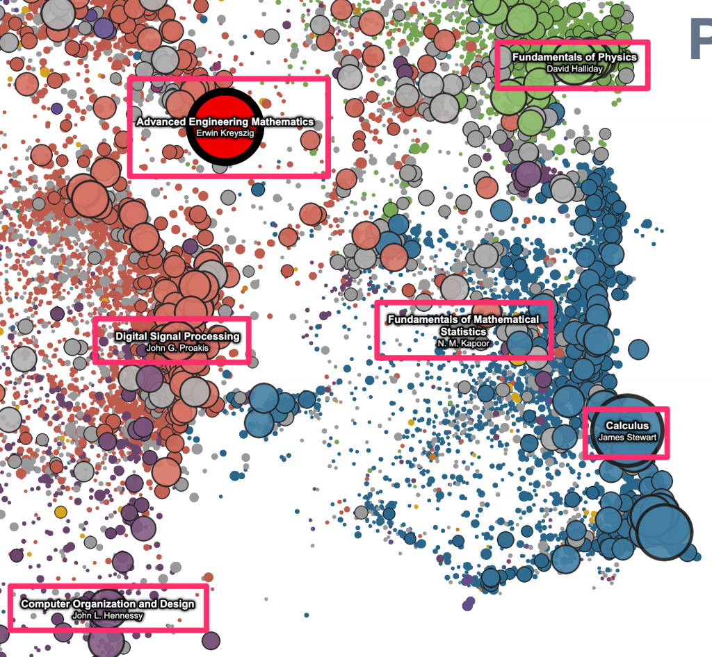
For the pan and zoom mechanics, we’re using a technique that I learned from Ben Schmidt – use d3-zoom to listen for the gesture events on the container element, and then pass the (x, y, k) zoom transform to the vertex shader as a uniform, which can then be used to set gl_Position and gl_PointSize. (See Ben’s description here.) This works great – it’s easy to implement and super fast. And, as Ben points out, maybe the biggest advantage is that this makes it really easy to layer regular 2d canvas/svg elements that “move” with the data on the plot – just listen for changes to the zoom transform, and then apply it to canavas/svg elements stacked on top of the plot. We’re making use of this pretty heavily here, for most of the “annotations” that get drawn on top of the raw points. Eg, the red highlight points that appear on hover / click, and point labels that are automatically displayed for the N largest visible works –
The “geometric” labels that zoom with the data –
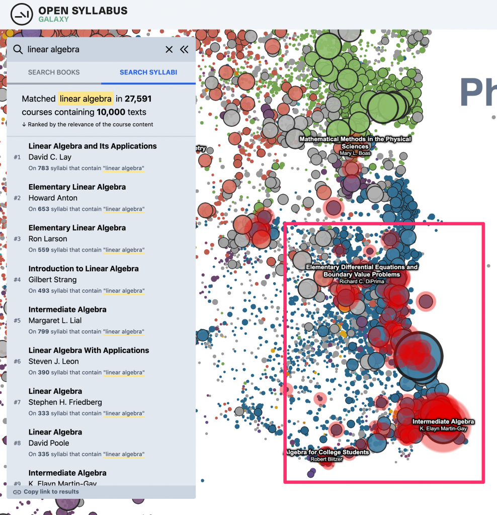
And, the “heatmap” overlay that highlights the location of the search results on the plot –
I really like this pattern – it gives you access to the whole ecosystem of 2d APIs and libraries, which is often a much better fit for this kind of stuff (eg, drawing text in WebGL is a headache). And, it also makes it easy to structure the code in a really decoupled, modular way – each of these “layers” can be written as an independent plugin, in effect, which just needs to subscribe to a couple of events on the plot.
Topic search
Last but not least – in addition to the updates to the dataset and plot viewer, we also added one significant new piece of functionality: A new way of searching inside the plot, which is sort of a sandbox for a way of navigating the OS data that we’re interested in exploring more deeply in the future. Before, you could just do a direct metadata search over the title and author strings for the works in the plot. (This is still there as the default search result type, under “search books.”) This makes it easy to find specific books or authors if you already know what you’re looking for. And, it also works OK for certain kinds of “topic”-like queries where there are lots of books with titles that literally contain the keyword(s) in question. Eg, for something like “linear algebra” – there are a bunch of textbooks that have “linear algebra” in the title, so just by searching against the titles in the catalog, you get a good sense of where in the plot to look.
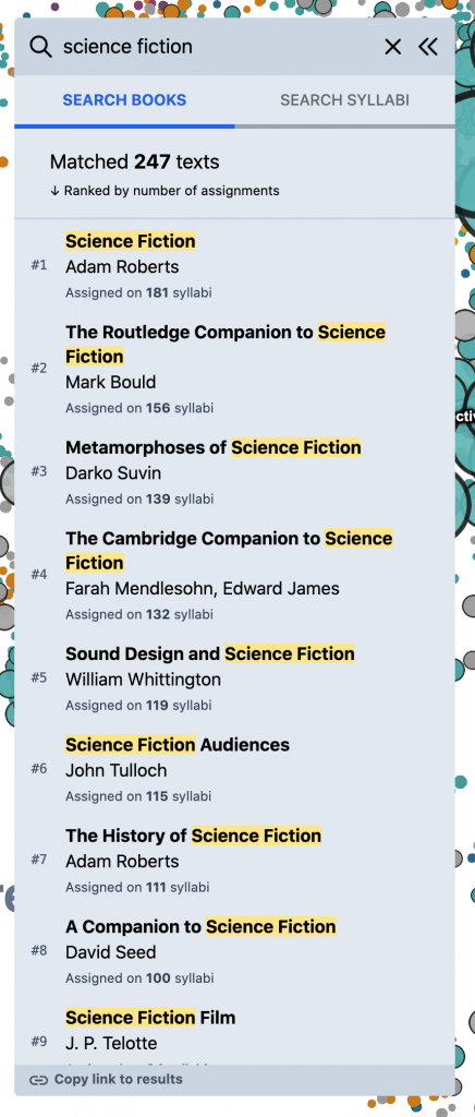
But, for other kinds of queries, this doesn’t work as well. Eg, for something like “science fiction” – if you search against the book titles directly, you mostly get anthologies and academic monographs; but very few actual works of science fiction –
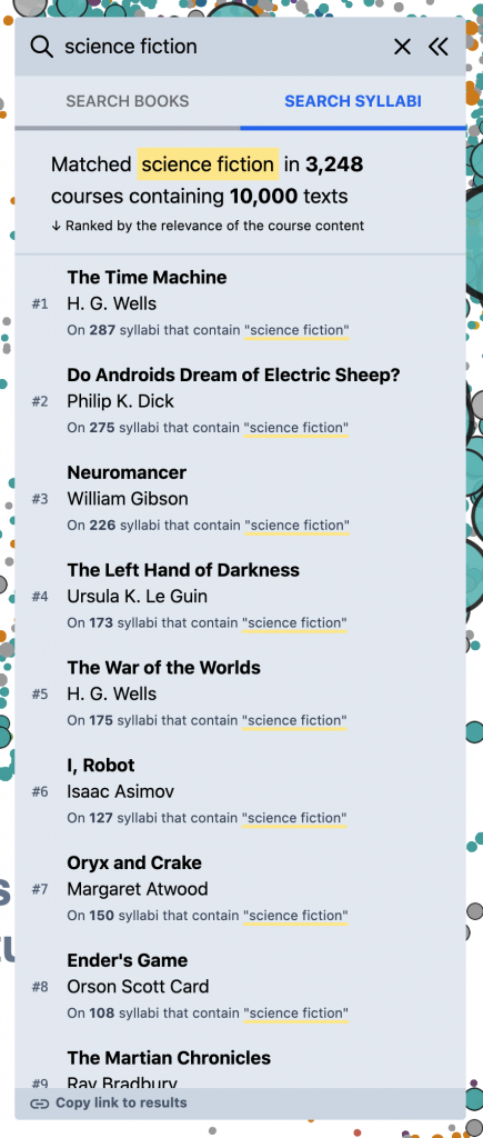
What you really want, for this kind of query, is to search inside of the syllabi themselves – the course descriptions, titles, learning objectives, topic lists, schedules, etc. – and then build a reading list based on the books and articles assigned in the most relevant courses. To experiment with this, we added the “Search Syllabi” result type in the left panel that does just this. (Though currently in a somewhat limited way – we just search against the course titles and description paragraphs, for a subset of the corpus.) Eg, for “science fiction,” we start to get a much better view of the primary texts in the field –
This starts to open the door to a more granular, “sliced” view of the OS data that I’ve always wanted. Other examples –
media theorydevelopmental psychologyblack lives matterclimate changeafrican american literaturecognitive sciencerussian literature
It’s also interesting to plug in more generic, open-ended terms, and see what comes out –
Anyway, this is sort of a sandbox version of this functionality to figure out if it’s useful. We’d love feedback about whether this works – if it’s intuitive, if the results are interesting.
Prior art + inspiration
There’s been a lot of really cool work in the last couple years at the overlap of UMAP, WebGL-powered scatterplots, and – more broadly – large-scale visualizations of latent spaces. In particular, I’ve learned and borrowed a huge amount from –
- Leland McInnes – UMAP, of course!
- Ben Schmidt’s visualization of the HathiTrust catalog, and other scatterplot experiments; especially for pointing me towards regl and the d3-zoom pattern described ☝️.
- Peter Beshai’s blog posts about using regl to animate big scatterplots; especially some of the shader logic for converting from pixel -> NDC coordinates.
- Doug Duhaime’s PixPlot and UMAP zoo; and other conversations about webgl tradecraft.
- Grant Custer’s UMAP visualization of MNIST, which first got me interested in webgl.
- Emily Reif’s dynamically-generated plots of BERT word embeddings.
- Max Noichl’s beautiful UMAP plots of citation data in philosophy and economics.
- Colin Eberhardt’s treatment of Ben Schmidt’s HTRC plot.
- Shan Carter, Zan Armstrong, Ludwig Schubert, Ian Johnson, Chris Olah – UMAP plots of “feature visualizations” extracted from image classifiers.
- Matt Miller’s network visualizations of the NYPL catalog data back in 2014, which blew my mind and initially got me interested in these kinds of large-scale knowledge mapping projects.
- And, I’m sure many more things that have come across my Twitter feed, but I’m forgetting now.